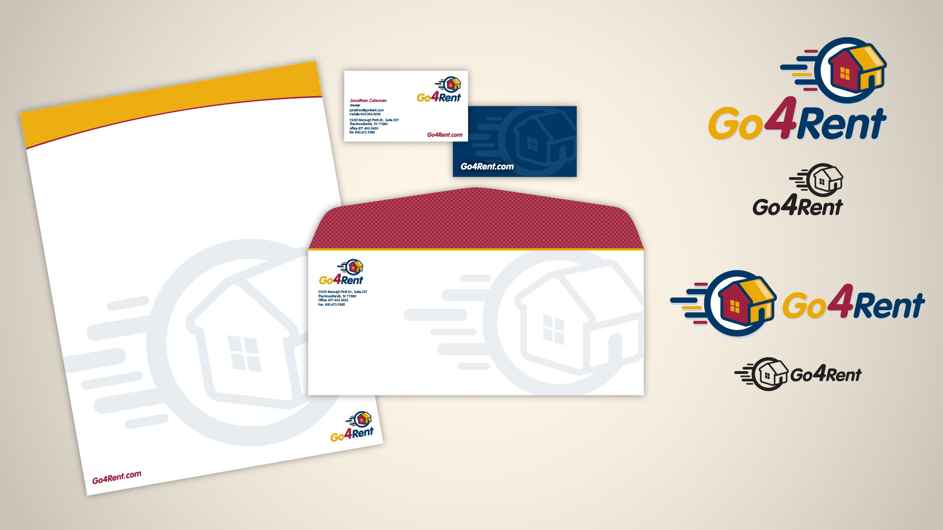
Go4Rent has been an awesome client for several years. I have continued to be an exclusive resource in which the company can rely. My initial job with Go4Rent was to establish an identity for them. They are an online service that speeds up the process of attaining, approving and leasing properties.
Identity
The idea was to put a house in motion to simulate the speedy process from both sides of the renting spectrum, both realtors and tenants.
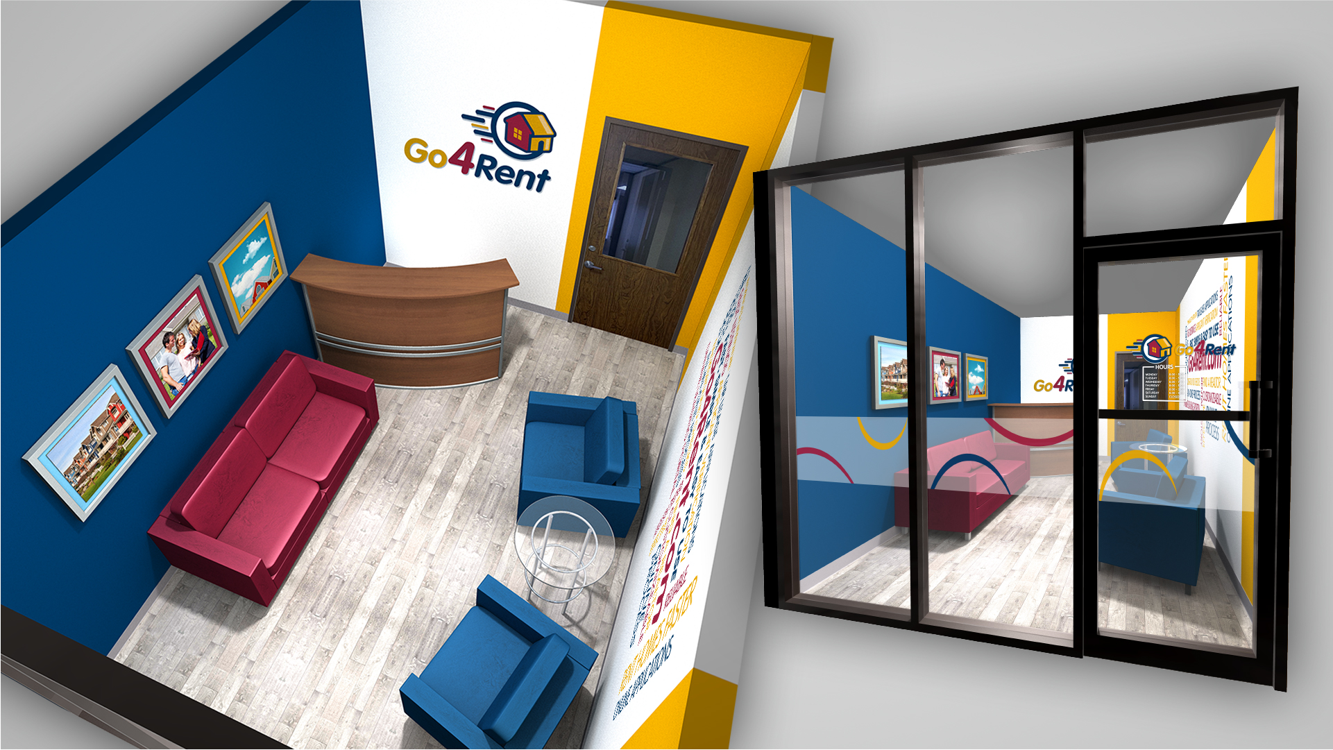
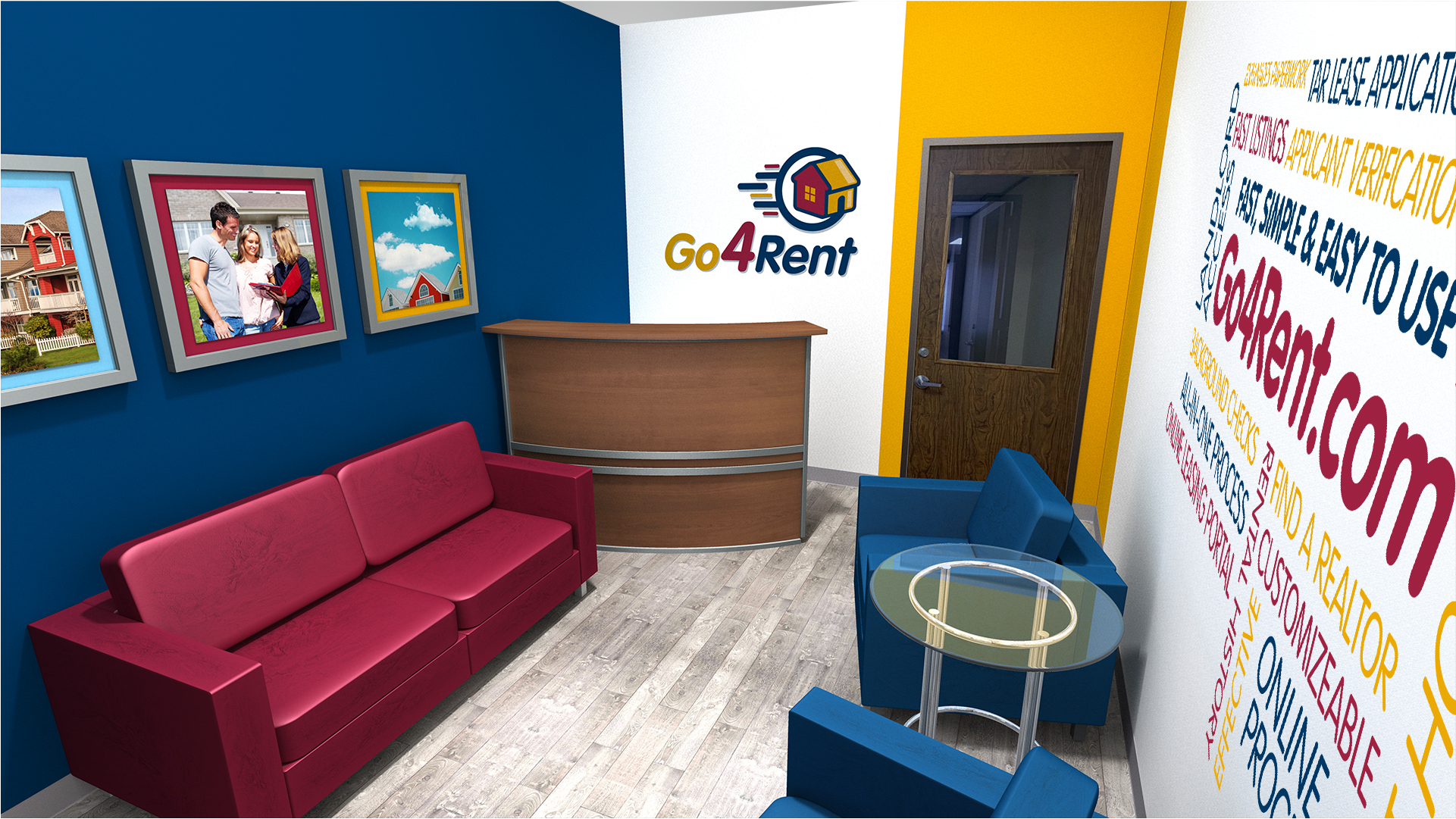
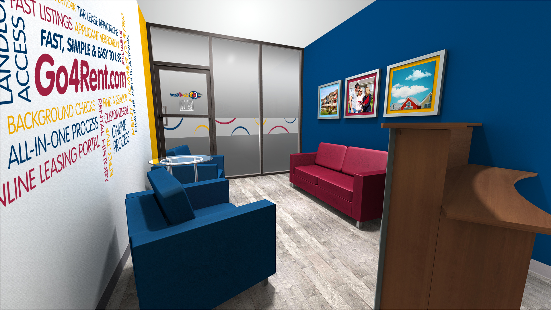
Office Design
I treated their graphic with muted primary colors, and whimsical imagery. I wanted this playful appeal in the design of the Go4Rent office. I recommended a 3D logo on the wall, so incomers see it immediately upon entry. I used seating and paint highlights in brand colors, along with a contemporary table and reception desk.
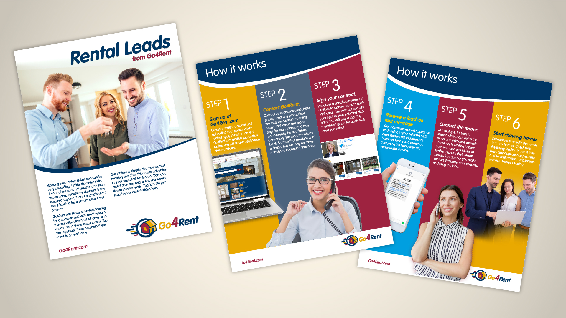
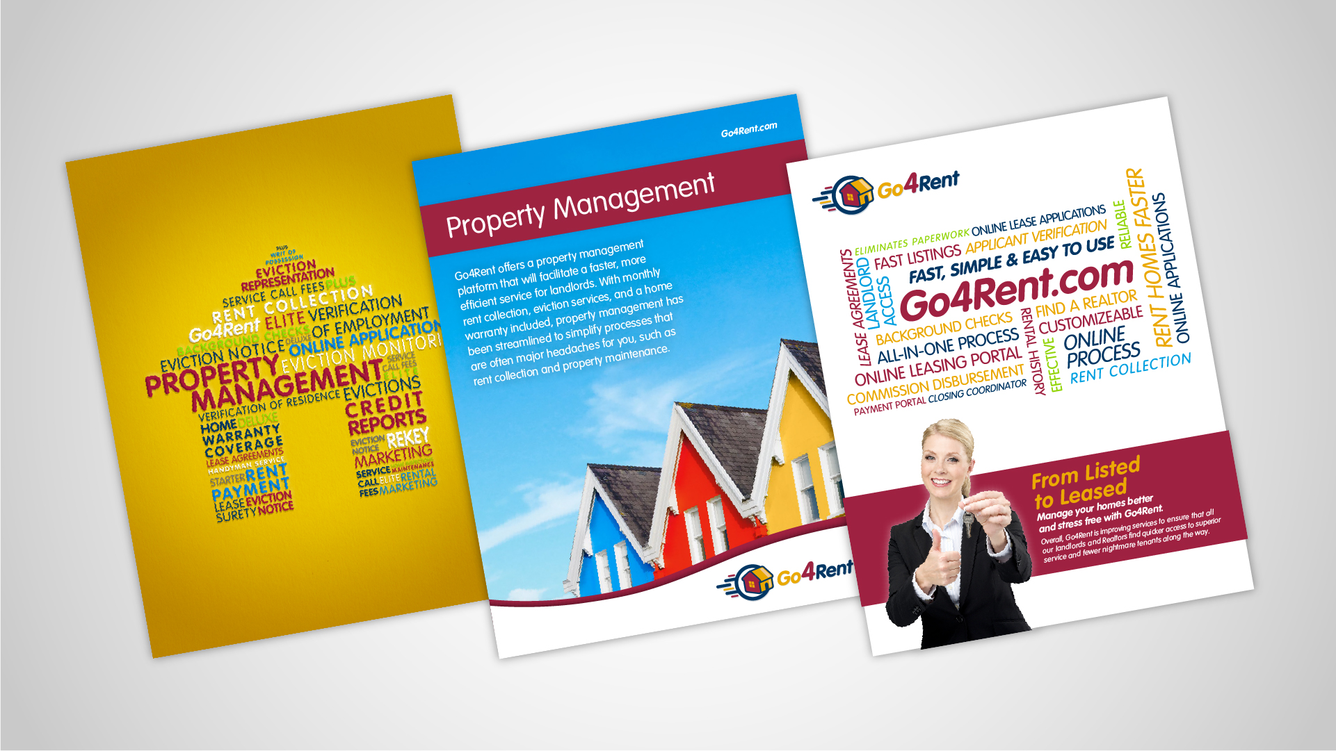
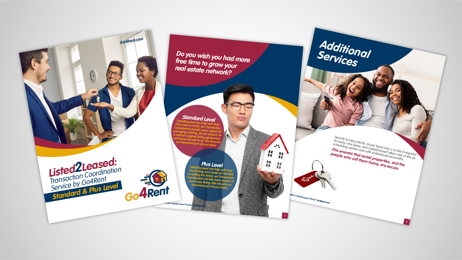
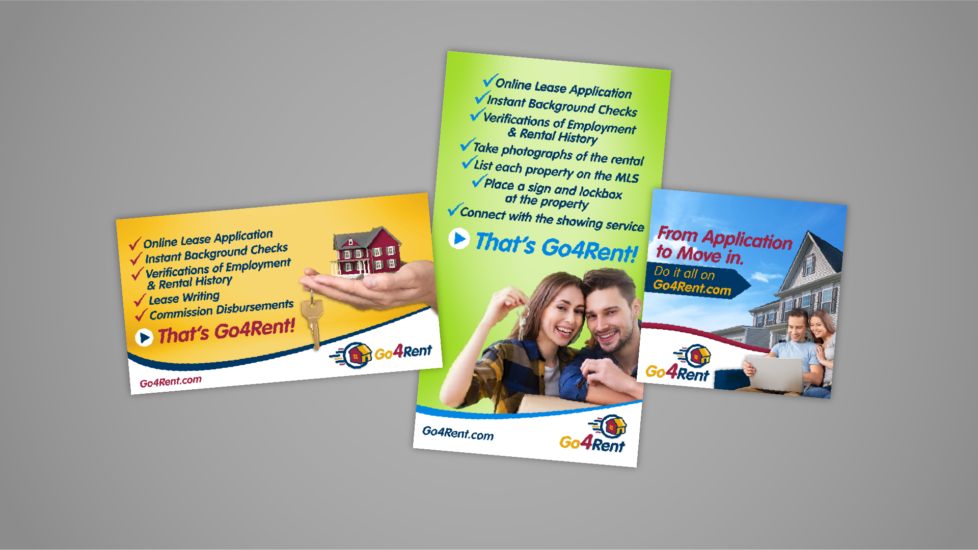
Brochure Layout
I have created several digital and printed brochures and flyers that explain Go4Rent’s processes. Many have similar looks for consistency, but I am glad I can often experiment with different layout concepts, imagery and shapes.
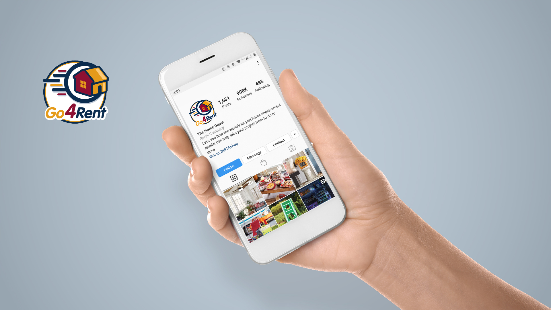
Digital Graphics
Since this is primarily an online process, I was asked to create an icon to be used on all social media posts. Also, digital ads have been used for targeted online opportunities.
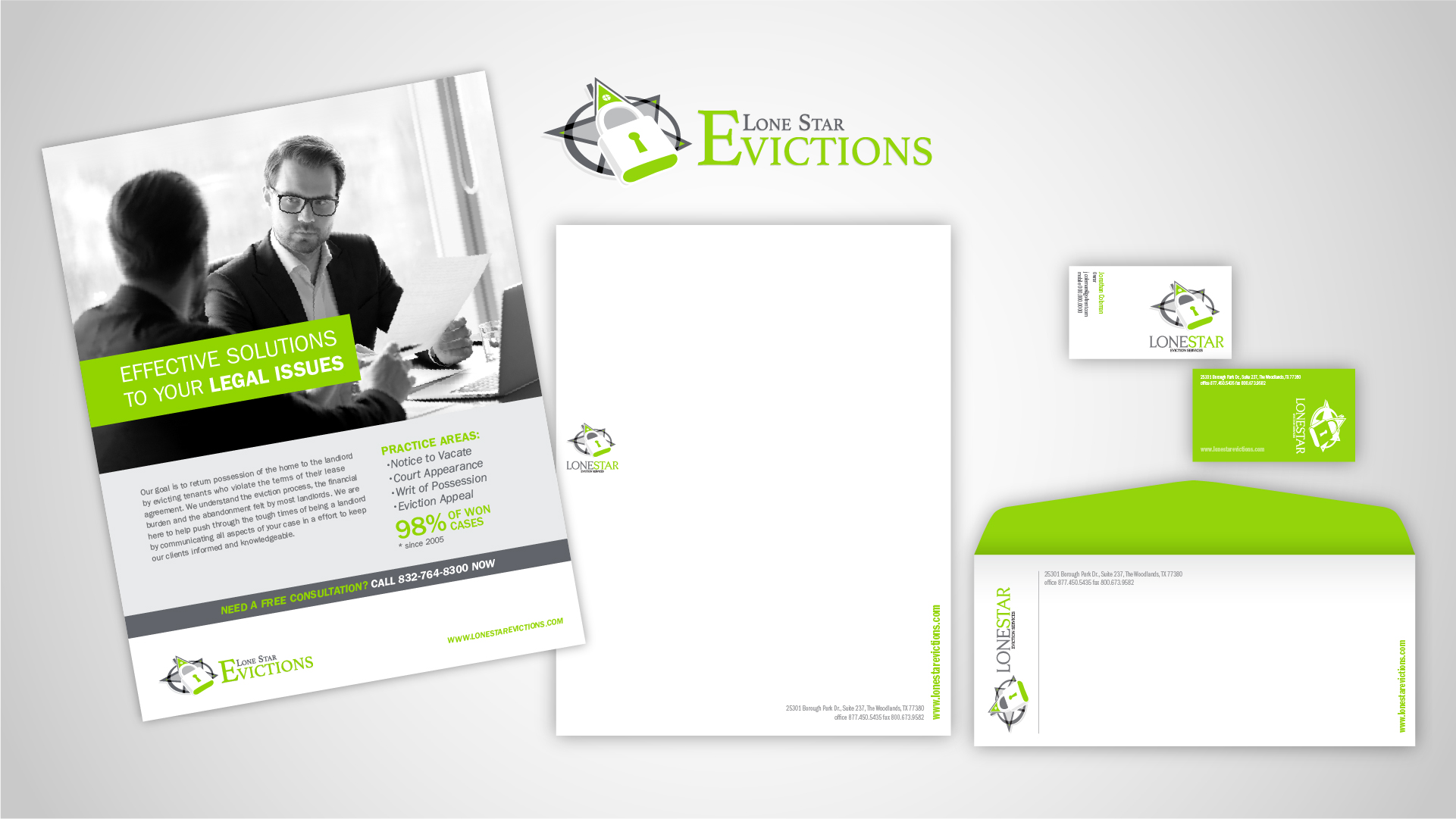
LoneStar Evictions
LoneStar Evictions is a subsidiary of Go4Rent. I was asked to develop an identity package for this entity. I made it strikingly different than Go4Rent’s color scheme and content. Since this is serious matter within real estate, I used an “energy green” vs. black and white imagery. This is to help stand out, in order to make an “in-your-face” graphic statement.
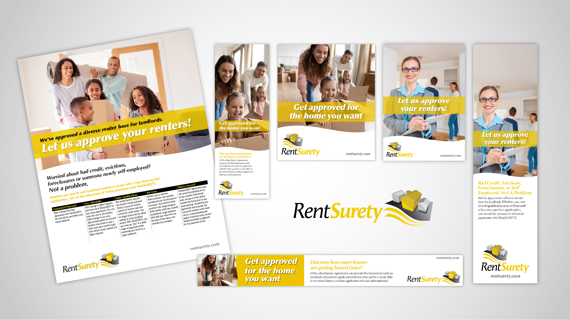
RentSurety
RentSurety is another subsidiary’s identity in which I was privileged to create. The logo represents the layers of legal documented protection for realtors to rent to a diverse base of tenants. The bright yellow helps push the call-to-action, while the imagery sets a “piece-of-mind” tone.
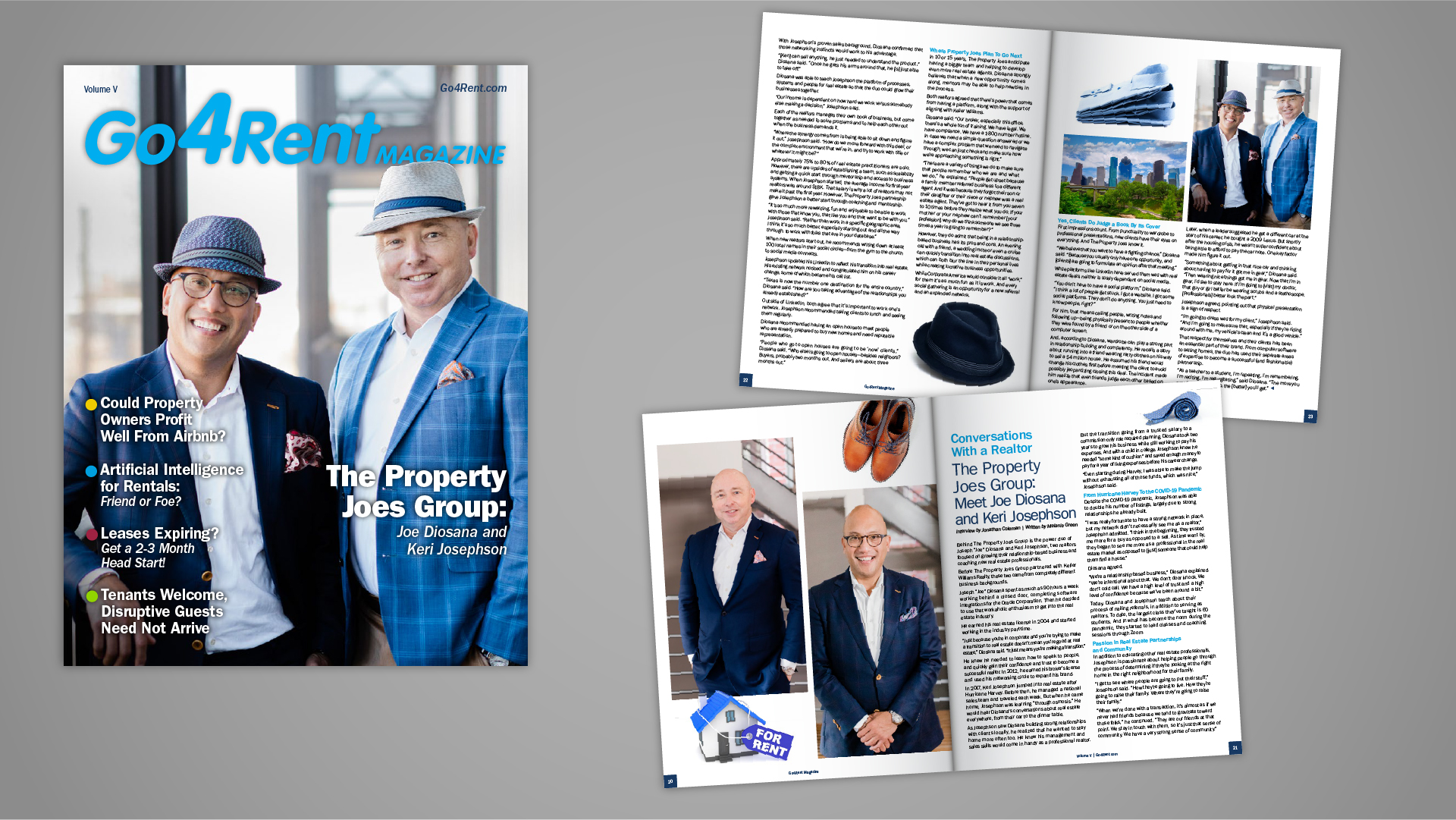
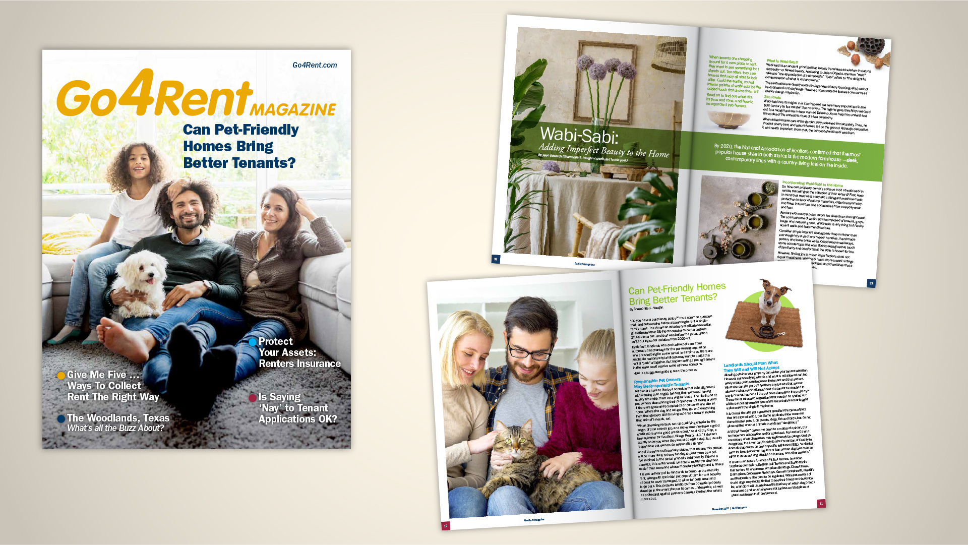
Go4Rent Magazine
Go4Rent decided to create a magazine based on the region's realtors, city, towns, and real estate market. I created the masthead that allows for use of secondary brand colors and cover overlaps. The magazine allows for great artistc expression with color, imagery, and image orientation. I'm always looking forward to the next issue!